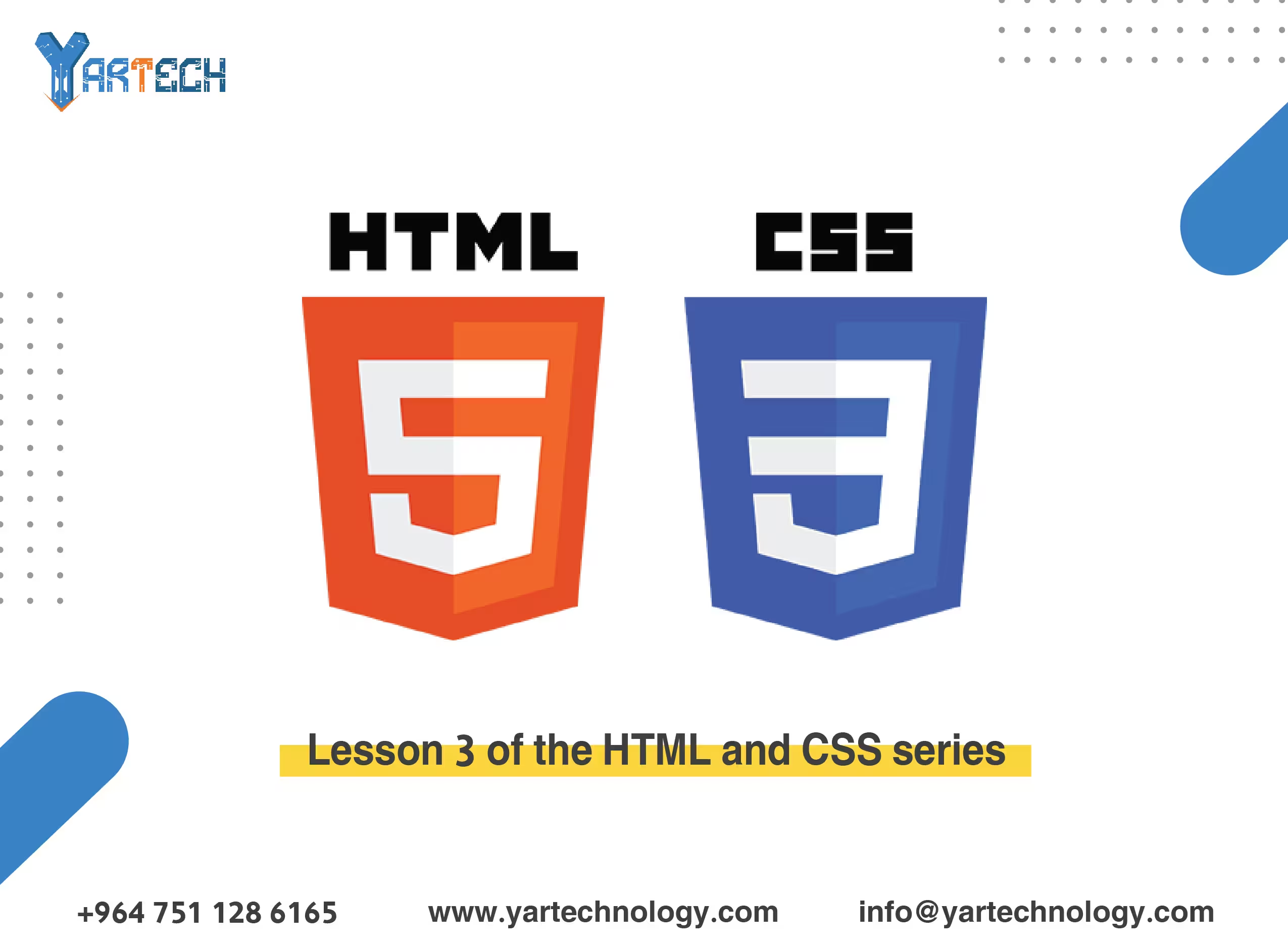
Lesson 3 of the HTML and CSS series
Formatting pages with CSS. We will learn how to use CSS to give your pages a professional look.
Website design
February 6, 2025
Welcome to the third lesson in our HTML and CSS learning series! 🎉
In this lesson, we will focus more on formatting pages using CSS . We will learn how to use CSS to give your pages a professional look, including colors, fonts, margins, containers, and backgrounds. Additionally, we will cover some advanced concepts like Responsive Design using Media Queries .
1. Quick Review
In the previous lesson, we learned:
- How to create tables and forms.
- Using semantic tags like
<header>and<footer>. - Adding simple styles using CSS.
Now, we will move on to a higher level of styling with CSS!
2. Advanced CSS Basics
A. Colors
Colors can be specified using:
- Color names (e.g.,
red,blue). - Hexadecimal values (e.g.,
#FF5733). - RGB values (e.g.,
rgb(255, 87, 51)). - RGBA values where "A" stands for transparency (e.g.,
rgba(255, 87, 51, 0.5)).
Example:
B. Fonts
You can change font types using the font-family property. You can also adjust font size using font-size.
Example:
💡 Tip : You can use custom fonts from Google Fonts by adding a link in the <head>:
Then use it in your CSS:
C. Margins and Padding
margin: Defines the external space around an element.padding: Defines the internal space inside an element.
Example:
D. Backgrounds
You can customize element backgrounds using:
- Background color (
background-color). - Background image (
background-image). - Image repetition (
background-repeat).
Example:
3. Box Model Design
Every element in HTML is treated as a "box" consisting of:
- Content : The text or image inside the element.
- Padding : The space between the content and the border.
- Border : The line around the element.
- Margin : The space between the element and other elements.
Example:
4. Responsive Design
A. Flexible Units
Instead of using fixed units like px, you can use flexible units such as:
%: Percentage relative to the parent container.em: Percentage relative to the font size.rem: Percentage relative to the base font size of the page.
Example:
B. Media Queries
These are used to apply different styles based on screen size.
Example:
5. Practical Exercise
Try creating an HTML page that includes the following:
- Weekly Schedule Table :
- Use CSS to change the background color of headers.
- Add borders and different colors for cells.
- Simple Registration Form :
- Use CSS to style the form (colors, margins, borders).
- Make the form look good on small screens using Media Queries.
- Responsive Design :
- Add Media Queries to make the page look good on all devices.
6. What’s Next?
In the next lesson, we will dive deeper into advanced CSS techniques like:
- Animations.
- Shadows.
- Modern layouts (Flexbox and Grid).
📌 Tip : Don’t hesitate to experiment with the code yourself and modify it to see the results. Practice is the key to mastery! 🚀
Comments

There are no comments
Please login to leave a review