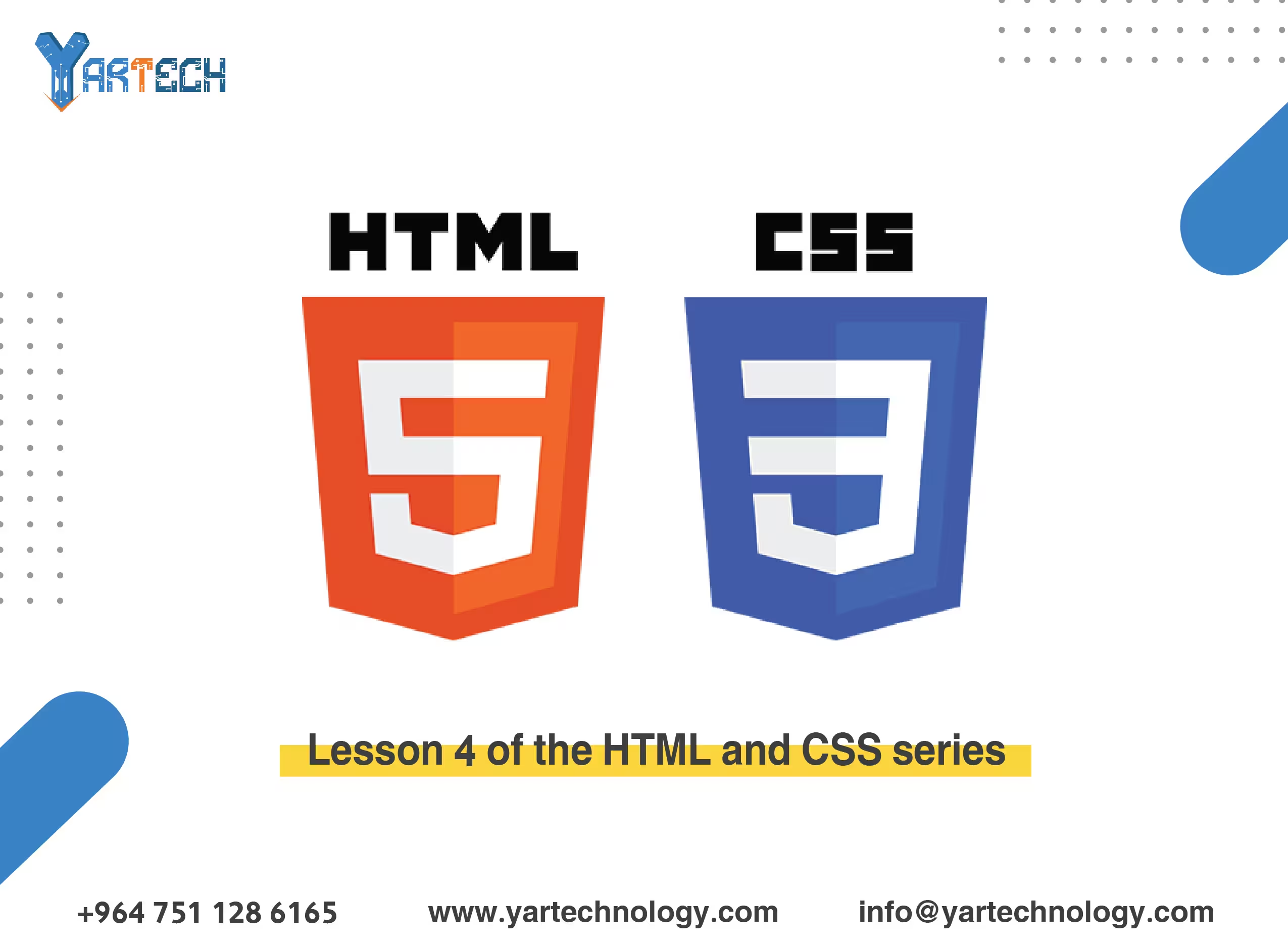
Lesson 4 of the HTML and CSS learning series
How to use Flexbox and Grid to create modern, flexible layouts, as well as animations and shadows.
Website design
February 7, 2025
Welcome to the fourth lesson in our HTML and CSS learning series! 🎉
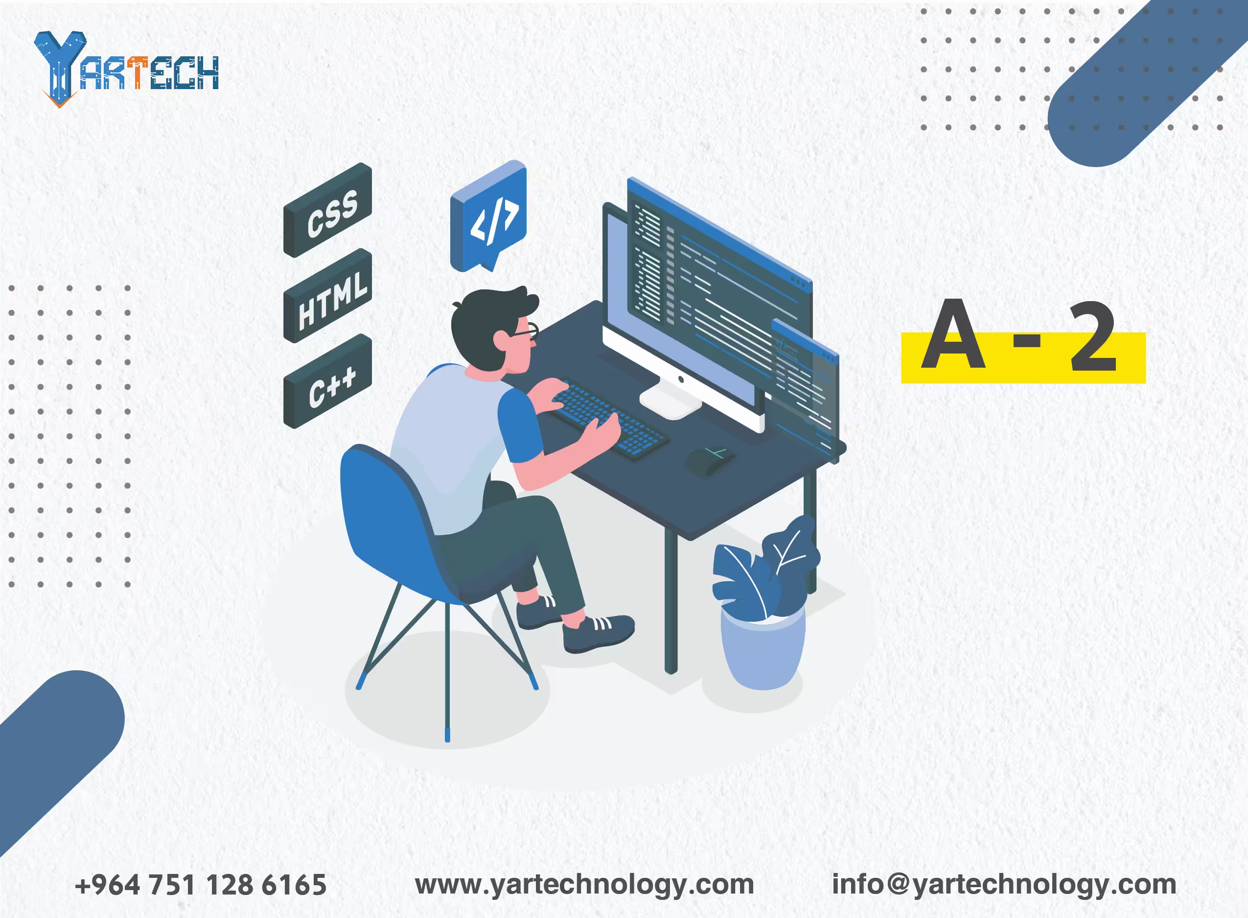
In this lesson, we will focus on advanced CSS techniques that will allow you to create more professional and dynamic designs. We will learn how to use Flexbox and Grid to create modern and flexible layouts, as well as visual effects like animations and shadows .
1. Quick Review
In the previous lesson, we learned:
- How to style pages using CSS.
- Colors, fonts, margins, containers, and responsive design.
Now, we will move on to more advanced techniques like Flexbox and Grid , as well as visual effects such as animations and shadows.
2. Flexbox: The Flexible Layout System
What is Flexbox?
Flexbox is a layout system that allows you to distribute elements flexibly within a horizontal or vertical container. It is known for its ease of use and ability to control the arrangement of elements and the distribution of space.
Basic Flexbox Properties:
Container Properties:
display: flex;: Converts the container into a Flexbox system.flex-direction: Specifies the direction of the elements (row,column).justify-content: Distributes elements horizontally (center,space-between,flex-start).align-items: Distributes elements vertically (center,flex-start,flex-end).
Item Properties:
flex-grow: Determines how much an item can grow.flex-shrink: Determines how much an item can shrink.flex-basis: Specifies the base size of the item.
Practical Example:
3. Grid: The Grid Layout System
What is Grid?
Grid is another layout system that allows you to create complex layouts using a grid of rows and columns. It is suitable for both fixed and flexible layouts.
Basic Grid Properties:
Container Properties:
display: grid;: Converts the container into a Grid system.grid-template-columns: Specifies the number of columns and their widths.grid-template-rows: Specifies the number of rows and their heights.gap: Specifies the spacing between rows and columns.
Item Properties:
grid-column: Specifies the item's position within the columns.grid-row: Specifies the item's position within the rows.
Practical Example:
4. Animations
How Do Animations Work?
Animations are used to gradually change the properties of an element over a specified period of time.
Steps to Create Animations:
@keyframes: Define the stages of the animation.animation: Apply the animation to the element.
Practical Example:
5. Shadows
Types of Shadows:
- Text Shadow : Shadows for text.
- Box Shadow : Shadows for elements.
Practical Example:
6. Practical Exercise
Try creating an HTML page that includes the following:
-
Layout Using Flexbox :
- Flexible rows and columns.
- Horizontally and vertically centered elements.
-
Layout Using Grid :
- A grid with 3 columns and 2 rows.
- Elements with equal spacing.
-
Animations :
- A box that moves from left to right.
-
Shadows :
- Text and elements with beautiful shadows.
7. What’s Next?
In the next lesson, we will learn:
- How to add interactive effects using JavaScript.
- Creating a "Show/Hide" button for text.
- Building a dynamic slider.
📌 Tip : Don’t hesitate to experiment with the code yourself and modify it to see the results. Practice is the key to mastery! 🚀


yasir alkurdi
1 year ago
درس مفيد جدا شكرا لكم